増改築を繰り返して冗長になったCSSを簡略化したい。トップページやカテゴリー毎、タグ毎などのアーカイブページで一覧表示される「記事タイトル」部分を、今更flexbox化する。
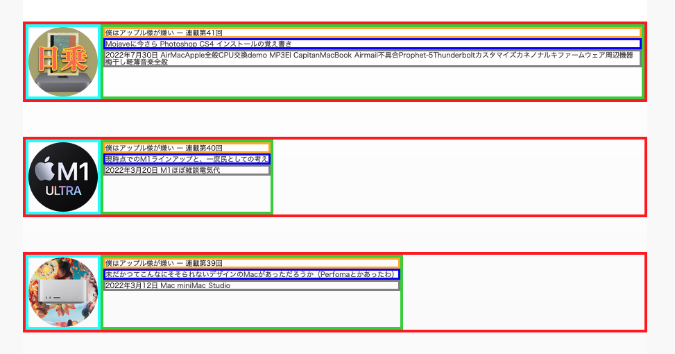
これまでは上図のような古めかしい構造だった。左側に配置した画像の右側に記事タイトルなどのテキストを回り込ませ、適宜位置調整をしていた。タグは主に見出し(h5など)を応用してCSSで装飾。
しかしこの場合、記事タイトルが長くなったり、タグの数が多くなったりした時にレイアウトがズレたりしていた。後からツギハギ的に改修していたが、今後の記憶力低下を考えると「あの時自分は何を考えてこの処置を施したのか」で戸惑うならまだしも、ゆくゆくは「何がどうなっているのか分からない」にまで到達するXデーが近い。
ようやくflexbox化
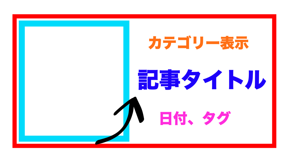
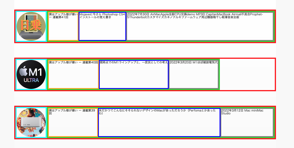
下図のように構成したい。
そこでまずはかなりシンプルなCSSでクラスを用意し、ボックスを組み立てて、ちまちまと挙動を見て行く事にする。
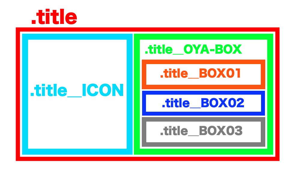
1.「width: auto;」なボックスを作って組み立て
「.title_ICON」に収納するキャッチアイコンは、使用画像サイズを100pxと決めているので「width: 100px;」を指定している。
#post section#title {
	width: auto;
	height: auto;
}

#post section#title .title_ICON {
	width: 100px;
	height: auto;
}

#post section#title .title_OYA-BOX {
	width: auto;
	height: auto;
}

#post section#title .title_BOX01 {
	width: auto;
	height: auto;
}

#post section#title .title_BOX02 {
	width: auto;
	height: auto;
}

#post section#title .title_BOX03 {
	width: auto;
	height: auto;
}
2.大家に「display: flex;」を追記
#post section#title {
	width: auto;
	height: auto;
	display: flex;
}

#post section#title .title_ICON {
	width: 100px;
	height: auto;
}

#post section#title .title_OYA-BOX {
	width: auto;
	height: auto;
}

#post section#title .title_BOX01 {
	width: auto;
	height: auto;
}

#post section#title .title_BOX02 {
	width: auto;
	height: auto;
}

#post section#title .title_BOX03 {
	width: auto;
	height: auto;
}
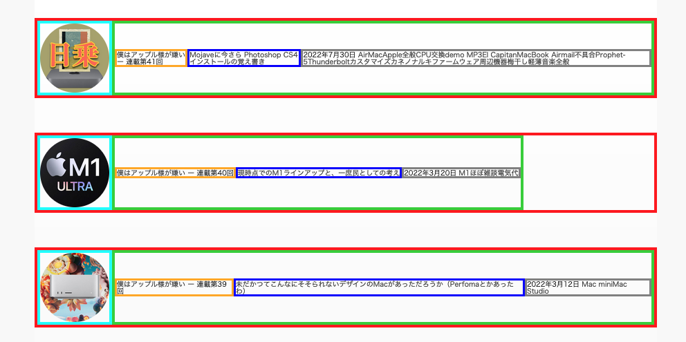
最上位階層に「display: flex;」を追記すると、その直下に内包しているボックス「.title_ICON」「.title_OYA-BOX」が横に並ぶ。「.title_OYA-BOX」に内包されているBOX01〜03は縦方向に並んでいる。
「.title_OYA-BOX」の横幅は中身の幅にフィット。例えば2番目の記事はBOX01〜03の文字数が少ないので、それに即した横幅になっている。しかし「.title_OYA-BOX」内で横並びにはならない。つまり「display: flex;」は直下の要素にしか効かないらしい。
各要素をボックスの縦方向に関して上下からの「中央揃え」にしたい
1.まずは「.title_OYA-BOX」をflexboxにする
「.title_OYA-BOX」内の要素が上側に詰めて配置されているのを、縦方向に対して「中央揃え」にしたい。そこでまず15行目に「display: flex;」を追記してみると、上図のように横並びになってしまった。
#post section#title {
	width: auto;
	height: auto;
	display: flex;
}

#post section#title .title_ICON {
	width: 100px;
	height: auto;
}

#post section#title .title_OYA-BOX {
	width: auto;
	height: auto;
	display: flex;
}

#post section#title .title_BOX01 {
	width: auto;
	height: auto;
}

#post section#title .title_BOX02 {
	width: auto;
	height: auto;
}

#post section#title .title_BOX03 {
	width: auto;
	height: auto;
}
2.惜しい、「align-items: center;」は違う
「.title_OYA-BOX」の16行目に「align-items: center;」を追記してみたのが上図。確かに要素は縦方向に関して中央揃えになっているのだが、要素が全て横並びのままである。これは違う。
#post section#title {
	width: auto;
	height: auto;
	display: flex;
}

#post section#title .title_ICON {
	width: 100px;
	height: auto;
}

#post section#title .title_OYA-BOX {
	width: auto;
	height: auto;
	display: flex;
	align-items: center;
}

#post section#title .title_BOX01 {
	width: auto;
	height: auto;
}

#post section#title .title_BOX02 {
	width: auto;
	height: auto;
}

#post section#title .title_BOX03 {
	width: auto;
	height: auto;
}
3.内包要素を縦方向に並べる「flex-direction: column;」を親のボックスに追記
そこで、flexboxの縦方向に要素を並べる「flex-direction: column;」を「.title_OYA-BOX」の16行目に追記。要素は横幅が小さくても強制的に縦方向に並ぶようにはなったのだが、これもちょっと違う。ボックスの中で、各要素が横方向に対して中央揃えになってしまっている。
#post section#title {
	width: auto;
	height: auto;
	display: flex;
}

#post section#title .title_ICON {
	width: 100px;
	height: auto;
}

#post section#title .title_OYA-BOX {
	width: auto;
	height: auto;
	display: flex;
	flex-direction: column;
	align-items: center;
}

#post section#title .title_BOX01 {
	width: auto;
	height: auto;
}

#post section#title .title_BOX02 {
	width: auto;
	height: auto;
}

#post section#title .title_BOX03 {
	width: auto;
	height: auto;
}
4.ボックス内の縦方向に中央揃えさせる「justify-content: center;」に修正

そこで今度は「justify-content: center;」で17行目を書き換えてみたものが上図。これが今回の目標だった状態。
#post section#title {
	width: auto;
	height: auto;
	display: flex;
}

#post section#title .title_ICON {
	width: 100px;
	height: auto;
}

#post section#title .title_OYA-BOX {
	width: auto;
	height: auto;
	display: flex;
	flex-direction: column;
	justify-content: center;
}

#post section#title .title_BOX01 {
	width: auto;
	height: auto;
}

#post section#title .title_BOX02 {
	width: auto;
	height: auto;
}

#post section#title .title_BOX03 {
	width: auto;
	height: auto;
}
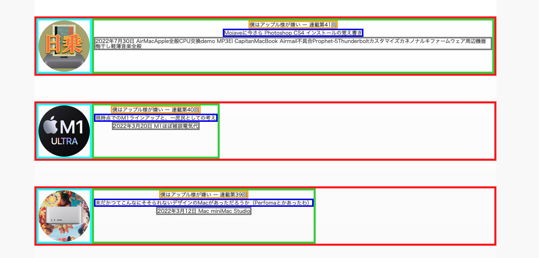
5.キャッチアイコン画像も縦方向中央に来るようにしておく

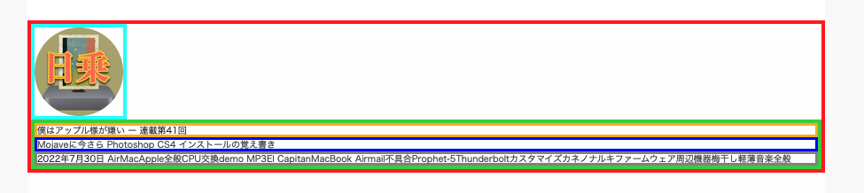
タイトルやカテゴリーリンクなどの文字装飾を行った状態が上図。記事タイトル側の文字数が多くて縦長になった場合、キャッチアイコン画像を格納しているボックス側でも、画像が縦方向中央に来るよう、10〜12行目に追記してflexbox化しておく(「日乗」アイコンの箇所参照)。
#post section#title {
	width: auto;
	height: auto;
	display: flex;
}

#post section#title .title_ICON {
	width: 100px;
	height: auto;
	display: flex;
	flex-direction: column;
	justify-content: center;
}

#post section#title .title_OYA-BOX {
	width: auto;
	height: auto;
	display: flex;
	flex-direction: column;
	justify-content: center;
}

#post section#title .title_BOX01 {
	width: auto;
	height: auto;
}

#post section#title .title_BOX02 {
	width: auto;
	height: auto;
}

#post section#title .title_BOX03 {
	width: auto;
	height: auto;
}
【CSS】width:autoとwidth:100%の違い(けんちゃん先生のWeb講座)
flexboxで要素の順番を入れ替える。(Qiita)
class(クラス)を複数指定して上手にCSSを書く方法【初心者向け】(ビギナーズハイ)
CSSのサイズの単位について(em, %, px, rem の使い分け)(ほんっとにはじめての HTML5 と CSS3)
CSSでボックスや画像の高さを揃えるには?Flexboxの活用テクニック(向壁虚造)
CSSレイアウトにfloatは古い!初心者でも始められるFlexbox入門(ics.media)
CSS:縦中央揃えにする方法まとめ(ゆずどっとこむ)
2022-08-28 > VPS&WordPress引っ越しメモ